In the world of data science, every dataset has a story to tell. In this article, we’ll embark on a journey to extract, analyze, and visualize EPFL’s restaurant menus. We’ll cover data scraping, exploratory data analysis (EDA), network processing, and even automation to keep our dataset up-to-date.
Data Scraping: The project starts with web scraping techniques to extract menu information, including item names, prices, and vegetarian options, from various EPFL campus restaurant websites.
Exploratory Data Analysis (EDA): With the menu data in hand, we leverage Python’s Pandas and Seaborn libraries for exploratory data analysis. This step allows us to uncover insights into menu trends, price distributions, and the proportion of vegetarian meals over time.
Network Analysis: Going beyond traditional analysis, we delve into the text within meal names. By constructing a text network of meal names using some text processing and visualizing with D3.js, we identify common ingredients and connections between them.
Automation: To ensure that menu data remains up-to-date without manual intervention, we’ve implemented automation using GitHub Actions. A scheduled workflow runs the menu scraping script daily and rebuilding the network, guaranteeing access to the latest information.
Data Scraping
We kickstart our journey with Python, a versatile language that excels at web scraping. We’ll use Python libraries such as requests, BeautifulSoup, and pandas to fetch and structure our data.
import requests
from bs4 import BeautifulSoup
import pandas as pd
import re
from tqdm import tqdm
Getting the Menu Data for a given Date
Our first goal is to retrieve the restaurant menu data for EPFL. We create a function get_menu(date) to fetch the menu for a specific date:
def get_menu(date):
    '''
        Get the menu for a given date.
        Input:
            - date (string): string in the format YYYY-MM-DD
        Returns:
            - menus (DataFrame): DataFrame containing the menu for the given date
    '''

    # Get the page content
    url = 'https://www.epfl.ch/campus/restaurants-shops-hotels/fr/offre-du-jour-de-tous-les-points-de-restauration/?date=' + date
    headers = {'User-Agent': 'Mozilla/5.0 (Windows NT 10.0; Win64; x64) AppleWebKit/537.36 (KHTML, like Gecko) Chrome/58.0.3029.110 Safari/537.36'}
    r = requests.get(url, headers=headers)
    r.encoding = 'utf-8'
    soup = BeautifulSoup(r.text, 'html.parser')

    # Create an empty DataFrame
    menus = pd.DataFrame(columns=['name', 'restaurant', 'etudiant', 'doctorant', 'campus', 'visiteur', 'vegetarian'])
    menus['vegetarian'] = menus['vegetarian'].astype('bool')

    # Find the menu table
    menuTable = soup.find('table', id='menuTable')
    if not menuTable:
        return menus

    # Find all menu items
    lunches = menuTable.find_all('tr', class_='lunch')
    if not lunches:
        return menus

    for item in lunches:
        name = item.find('div', class_="descr").text.replace('\n', '\\n')
        restaurant = item.find('td', class_='restaurant').text

        # If item has class 'vegetarian', then it's vegetarian
        vegetarian = 'vegetarian' in item['class']

       # Extract all price options for this menu item
        price_elements = item.find_all('span', class_='price')
        prices_dict = {}

        # Check if there is at least one price element
        valid_menu = True
        if price_elements:
            for price_element in price_elements:
                price_text = price_element.text.strip()
                price_category = price_element.find('abbr', class_='text-primary')

                # Check if there is a price category (abbreviation)
                if price_category:
                    category = price_category.text.strip()
                else:
                    category = 'default'

                # Check if the price format is valid (no characters after CHF)
                if not re.search(r'CHF\s*\S', price_text):
                    price_match = re.search(r'([\d.]+)\s*CHF', price_text, re.IGNORECASE)
                    if price_match:
                        price = float(price_match.group(1))
                        prices_dict[category] = price
                else:
                    # Discard the menu if this condition is met
                    valid_menu = False
                    break

        # If the menu is valid, add it to the DataFrame
        if valid_menu:
            # Fill missing prices with the default price, if it exists
            if 'default' in prices_dict:
                default_price = prices_dict['default']
                for category in ['E', 'D', 'C', 'V']:
                    if category not in prices_dict:
                        prices_dict[category] = default_price
            else:
                # Set missing prices to None
                for category in ['E', 'D', 'C', 'V']:
                    if category not in prices_dict:
                        prices_dict[category] = None

            menus = pd.concat([menus, pd.DataFrame({
                'name': [name],
                'restaurant': [restaurant],
                'etudiant': [prices_dict['E']],
                'doctorant': [prices_dict['D']],
                'campus': [prices_dict['C']],
                'visiteur': [prices_dict['V']],
                'vegetarian': [vegetarian]
            })])

    return menus
Fetching Menus for a Date Range
To build a comprehensive dataset, we create another function get_all_menus(start_date, end_date) to fetch menus for a range of dates:
def get_all_menus(start_date, end_date):
    '''
        Get the menus for a given date range.
        Input:
            - start_date (string): string in the format YYYY-MM-DD
            - end_date (string): string in the format YYYY-MM-DD
        Returns:
            - menus (DataFrame): DataFrame containing the menus for the given date range
    '''
    # Create an empty DataFrame
    menus = pd.DataFrame(columns=['date', 'name', 'restaurant', 'etudiant', 'doctorant', 'campus', 'visiteur', 'vegetarian'])
    menus['vegetarian'] = menus['vegetarian'].astype('bool')

    # Iterate over the date range
    for date in tqdm(pd.date_range(start_date, end_date)):
        day_menus = get_menu(date.strftime('%Y-%m-%d'))
        day_menus['date'] = date
        menus = pd.concat([menus, day_menus])
    return menus
I’ve ran this function for the date range 2022-01-03 to 2023-08-31, in order to have a baseline, and saved the results in a CSV file data/menus.csv.
Exploratory Data Analysis (EDA)
With our menu data in hand, it’s time for some EDA. We load the data and start by examining its structure:
import pandas as pd

menus = pd.read_csv('data/menus.csv')
We check for missing values and calculate summary statistics:
# Summary statistics
print("\nSummary Statistics:")
print(menus.describe())
           etudiant     doctorant        campus      visiteur
count  18038.000000  17642.000000  17542.000000  19849.000000
mean      10.423744     11.504200     11.897988     12.507411
std        3.815614      4.090794      3.968985      3.994251
min        0.000000      0.000000      0.000000      0.000000
25%        8.000000      9.000000      9.900000     10.000000
50%       10.000000     11.000000     12.000000     12.500000
75%       12.500000     13.500000     13.900000     14.900000
max       25.000000     25.000000     25.000000    122.000000
Key Insights from Summary Statistics
- The mean price for a student meal is lower than that of a doctoral student, which is lower than that of a campus employee, which is lower than that of a visitor. This makes sense as students are on a tight budget, and visitors are willing to pay more for a meal.
- The maximum price for a visitor meal is CHF 122, which is very high for a meal at an EPFL restaurant. This may be due to a typo by the restaurant, we’ll ignore this outlier from now on.
- The minimum price for a meal is CHF 0 (free), which is suspicious for a meal at an EPFL restaurant. This may be due to a typo by the restaurant but it might be interesting to investigate this further.
# Count the number of missing values in each column
missing_values = menus.isnull().sum()
print("\nMissing Values:")
print(missing_values)
Missing Values:
date             0
name             1
restaurant       0
etudiant      3212
doctorant     3608
campus        3708
visiteur      1401
vegetarian       0
dtype: int64
Key Insights from Summary Statistics
- We can see that there are missing values in the
etudiant,doctorant,campus, andvisiteurcolumns but that’s due to the fact that not all meals are offered at all price points. - There is one missing value in the
namecolumn, which is weird but unsignificant. - There are no missing values in the
date,restaurantandvegetariancolumns, which is good. - The number of missing values in the
visiteurcolumn is relatively low compared to the other columns. This is due to the fact that most meals have only one price point which is thevisiteurprice.
Visualizing Vegetarian Proportions
One interesting aspect of the data is the proportion of vegetarian meals over time. To visualize this trend, we calculate the proportion of vegetarian meals for each date and plot the trendline:
# Calculate the proportion of vegetarian meals for each date
menus_datetime = menus.copy()
menus_datetime['date'] = pd.to_datetime(menus_datetime['date'], format='%Y-%m-%d')
vegetarian_proportions = menus_datetime.groupby('date')['vegetarian'].mean().reset_index()

# Convert date to numeric values
vegetarian_proportions['date_numeric'] = pd.to_numeric(vegetarian_proportions['date'])

# Fit a polynomial regression model
coefficients = np.polyfit(vegetarian_proportions['date_numeric'], vegetarian_proportions['vegetarian'], 2)
poly = np.poly1d(coefficients)

# Create a regplot to visualize the trendline
plt.figure(figsize=(20, 6))
sns.scatterplot(data=vegetarian_proportions, x='date_numeric', y='vegetarian', s=50, label='Data')

# Create a smooth trendline using the polynomial model
x_values = np.linspace(vegetarian_proportions['date_numeric'].min(), vegetarian_proportions['date_numeric'].max(), 100)
y_values = poly(x_values)
plt.plot(x_values, y_values, color='red', label='Trendline')

plt.title("Trendline of Proportion of Vegetarian Meals Over Time")
plt.xlabel("Date")
plt.ylabel("Proportion")
plt.xticks(rotation=45)
plt.grid(True)

# X-ticks
ax = plt.gca()
ax.xaxis.set_major_locator(ticker.MaxNLocator(integer=True, prune='both'))

# Select approximately 10 evenly spaced date indices
date_indices = np.linspace(0, len(vegetarian_proportions) - 1, num=10, dtype=int)
selected_dates = vegetarian_proportions['date'].iloc[date_indices].dt.strftime('%Y-%m-%d')

# Set x-ticks and corresponding labels
ax.set_xticks(vegetarian_proportions['date_numeric'].iloc[date_indices])
ax.set_xticklabels(selected_dates, rotation=45)

# Adjust layout and display the plot
plt.tight_layout()
plt.show()
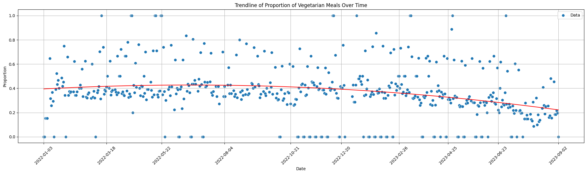
Key Insights from Vegetarian Proportions
- On average, the proportion of vegetarian meals appears to be stable over time (a regression line around 40%), with a slight downward trend in recent months.
- There are a few outliers with a proportion of 0% or 100% vegetarian meals that may be due to no/few meals being offered on that day. It may be worth investigating these outliers further.
- Some days have a higher proportion of vegetarian meals than others. This may be due to the vegetarian days policy at EPFL, where some days are vegetarian-only. It may be worth investigating this further to confirm this hypothesis.
Visualizing Price Distributions
We visualize the distribution of meal prices for students (etudiants) using histograms and boxplots:
# Create a figure with subplots for the histogram and boxplot
fig, (ax1, ax2) = plt.subplots(2, 1, figsize=(12, 10), sharex=False)

# Calculate the statistics for etudiant meal prices
mean_etudiant_price = menus['etudiant'].mean()
median_etudiant_price = menus['etudiant'].median()
q25_etudiant_price = menus['etudiant'].quantile(0.25)
q75_etudiant_price = menus['etudiant'].quantile(0.75)

# Histogram for the price distribution of etudiant meals
sns.histplot(data=menus, x='etudiant', bins=20, kde=True, ax=ax1)
ax1.set_title("Price Distribution of Etudiant Meals")
ax1.set_ylabel("Count")
ax1.set_xlabel("Price (CHF)")
ax1.axvline(mean_etudiant_price, color='r', linestyle='--', label=f"Mean: {mean_etudiant_price:.2f}")
ax1.grid(True)

# Boxplot for the price distribution of etudiant meals
sns.boxplot(data=menus, x='etudiant', ax=ax2, orient='h')
ax2.set_xlabel("Price (CHF)")
ax2.axvline(mean_etudiant_price, color='r', linestyle='--', label=f"Mean: {mean_etudiant_price:.2f}")
statistics_text = f"Mean: {mean_etudiant_price:.2f}\nMedian: {median_etudiant_price:.2f}\nQ25: {q25_etudiant_price:.2f}\nQ75: {q75_etudiant_price:.2f}"
ax2.text(0.8, 0.8, statistics_text, transform=ax2.transAxes, bbox=dict(facecolor='white', alpha=0.5))
ax2.grid(True)

# Adjust layout and display the plot
plt.tight_layout()
plt.show()
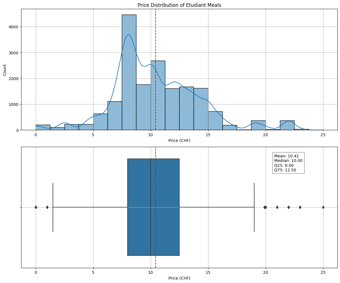
Key Insights from Price Distributions
- The majority of student meal prices fall within a certain range, with a few outliers at higher prices.
- The mean student meal price is approximately CHF 10.42, with a median price of CHF 10 which is high for a student budget.
Network Analysis
Now, let’s delve into network processing. We’ll clean the menu item names, remove stopwords, create a vocabulary, and identify bigrams (pairs of consecutive words) to represent relationships. We’ll then structure the data for network graph creation. Finally, we’ll visualize the network graph using D3.js.
Network Building
Data Preprocessing
We start by loading the dataset using Pandas:
import pandas as pd
import os

# Load the menu data from CSV
file_path = os.path.dirname(os.path.abspath(__file__))
menus = pd.read_csv(os.path.join(file_path, '..', 'data', 'menus.csv'), index_col=0)
One crucial preprocessing step is to clean the menu item names. We remove special characters, digits, and extra spaces. Additionally, we eliminate common stopwords such as “de,” “aux,” and “et” to focus on meaningful terms:
import re

def extract_tokens(text):
    if pd.isnull(text):
        return []

    text = text.lower()
    text = re.sub(r'[^\w\s]', '', text)
    text = re.sub(r'\d+', '', text)
    text = re.sub(r'\s+', ' ', text).strip()

    stopwords = [' ', 'de', 'aux', 'au', 'à', 'la', 'le', 'et', 'sur', 'du', 'chef', 'ou', 'notre', 'by', 'en']
    tokens = [token for token in text.split() if token not in stopwords]
    return tokens

tokens = menus['name'].apply(extract_tokens)
Building a Vocabulary
To create a network graph, we need to build a vocabulary from these cleaned tokens. We count the frequency of each term in the entire dataset:
    def create_vocabulary(tokens):
    vocabulary = {}
    for token_list in tokens:
        for token in token_list:
            if token in vocabulary:
                vocabulary[token] += 1
            else:
                vocabulary[token] = 1
    return vocabulary

vocabulary = create_vocabulary(tokens)
Identifying Bigrams
Now that we have our vocabulary, we can move on to creating the network graph. We’ll filter the vocabulary to include only terms that occur frequently enough (e.g., at least 100 times) to reduce noise in our visualization:
filtered_vocabulary = {k: v for k, v in vocabulary.items() if v >= min_frequency}
Next, we’ll generate bigrams (pairs of consecutive words) to represent relationships between terms. We calculate their frequencies and filter them based on our filtered vocabulary:
finder = nltk.BigramCollocationFinder.from_documents(tokens)
bigram_measures = nltk.collocations.BigramAssocMeasures()
bigrams = list(finder.score_ngrams(bigram_measures.raw_freq))

# Filter bigrams using the filtered vocabulary
filtered_bigrams = []
for bigram in bigrams:
    if (bigram[0][0] in filtered_vocabulary.keys() and bigram[0][1] in filtered_vocabulary.keys()):
        new_bigram = bigram[0]
        filtered_bigrams.append((new_bigram, bigram[1]))
Graph Creation
With the filtered vocabulary and bigrams in place, we can structure the data for our network graph. We define vertices (nodes) and edges (connections) based on this data:
vertices = []
sizes = list(filtered_vocabulary.values())
for i, term in enumerate(filtered_vocabulary.keys()):
    vertices.append({
        'id': term,
        'label': term,
        'size': sizes[i]
    })

edges = []
for i, edge in enumerate(filtered_bigrams):
    (source, target) = edge[0]
    edges.append({
        'id': i,
        'source': source,
        'target': target,
        'size': edge[1]
    })
Network Visualization with D3.js
To visualize our network graph interactively, we turn to D3.js. We create an HTML page that integrates the D3.js script:
<!DOCTYPE html>
<html>
<head>
    <title>EPFL Restaurant Menu Network</title>

    <!-- JQuery -->
    <script src="https://code.jquery.com/jquery-3.4.1.min.js"></script>

    <!-- D3.js -->
    <script src="https://d3js.org/d3.v4.min.js"></script>
</head>
<body>
    <svg id="mynetwork"></svg>
    <div id="bigramsCard">
        <h3 class="title">Top Bigrams</h3>
        <div id="topbigrams"></div>
    </div>
</body>
<!-- Custom Script -->
<script type="module" src="./network/network.js"></script>
</html>
We add some CSS styling to the page:
html,
body {
    min-height: 100%;
    height: 100%;
    min-width: 100%;
    margin: 0;
    padding: 0;
    font-family: sans-serif;
}

#mynetwork {
    position: absolute;
    top: 0;
    left: max(20%, 200px);
    right: 0;
    bottom: 0;
    width: min(80%, calc(100% - 200px));
    height: 100%;
    background-color: white;
}

#bigramsCard {
    position: absolute;
    top: 0;
    left: 0;
    bottom: 0;
    width: max(20%, 200px);

    background-color: ghostwhite;
    border-radius: 5px;
    border: 1px solid lightgray;

    z-index: 100;
    padding: 0;
    margin: 0;
    overflow-y: auto;
}

#topbigrams {
    padding: 15px;
}

.title {
    margin: 0;
    margin-top: 20px;
    font-size: 1.5em;
    font-weight: 800;
    text-align: center;
}

@media screen and (max-width: 800px) {
    #mynetwork {
        left: 0;
        width: 100%;
        top: max(20%, 100px);
        height: min(80%, calc(100% - 100px));
    }

    #bigramsCard {
        top: 0;
        left: 0;
        right: 0;
        width: 100%;
        height: max(20%, 100px);
    }
}
Finally, we need to create a D3.js script network.js to visualize the network graph.
Data Loading
We first start our script by loading data from JSON files containing network graph information.
fetch(`./network/edges.json`)
    .then(response => {
        if (response.status == 404) throw error;
        return response.json();
    })
    .then(links => {
        fetch(`./network/vertices.json`)
            .then(response => {
                if (response.status == 404) throw error;
                return response.json();
            })
            .then(nodes => {
                // core script //
            })
            .catch(err => {
                console.error(err)
                console.error("No data for vertices")
            })
    })
    .catch(err => {
        console.error(err)
        console.error("No data for edges")
    })
Here we fetch two JSON files: edges.json and vertices.json, which contain information about the links (edges) and nodes of the graph, respectively. If the data cannot be loaded, error messages are logged.
Graph Visualization Setup
We set up the initial parameters and elements for the network graph visualization such as title, width, and height.
title represents the title of the graph, and width and height are calculated based on the dimensions of the mynetwork container.
// Define variables for graph visualization
const title = 'Menus ingredients'
const width = $('#mynetwork').innerWidth()
const height = $('#mynetwork').innerHeight()
We then set up initial zoom settings, create a zoom handler function (zoom_handler), and create an SVG element (svg) inside the mynetwork container. The initial zoom level and zoom capabilities are defined here.
// Initial zoom settings
var initial_zoom = d3.zoomIdentity.translate(600, 400).scale(0.001);

// Add zoom capabilities
var zoom_handler = d3.zoom().on("zoom", zoom_actions);

// Create an SVG element
const svg = d3.select('#mynetwork')
    .attr('width', width)
    .attr('height', height)
    .call(zoom_handler)
    .call(zoom_handler.transform, initial_zoom)
Color Scale and Node Radius
We define the color scale and node radius for graph visualization. The color scale maps node sizes to colors, and the node radius defines the radius for nodes in the graph. To do so, we first calculate the maximum node size in the graph and define a color scale based on this value.
// Determine the maximum size value for node coloring
var max_value = 0
for (node of nodes) {
    if (node.size > max_value) max_value = node.size;
}

// Define a color scale
var color = d3.scaleLinear()
    .domain([1, max_value])
    .range(["yellow", "red"])

// Define the radius for nodes
const radius = 10
Force Simulation
We then set up the force simulation for node positioning within the graph.
// Create a simulation for node positioning
var simulation = d3.forceSimulation()
    .force("link", d3.forceLink().id(function (d) { return d.id; }))
    .force("center", d3.forceCenter(width / 2, height / 2))
    .force("collide", d3.forceCollide().radius(d => { return d.size * 2 * radius }).iterations(3))
    .on("tick", ticked);
Here, the force simulation is defined with forces for links, centering, and collision detection. The ticked function is called to handle node positions during simulation ticks.
SVG Elements and Drag Handler
We create SVG elements for links and nodes and defines a drag handler for nodes.
// Create SVG groups for links and nodes
var zoomable = svg.append("g").attr("class", "zoomable").attr('transform', initial_zoom),
    link = zoomable.append("g").attr('class', 'links').selectAll(".link"),
    node = zoomable.append("g").attr('class', 'nodes').selectAll(".node")

// Create a drag handler
var drag_handler = d3.drag()
    .on("start", dragstarted)
    .on("drag", dragged)
    .on("end", dragended);
SVG groups for links and nodes are created, and the drag handler is defined for node interactions.
Graph Initialization
We then initializes the graph with nodes and links.
restart()
The restart function is called to set up nodes, links, and their attributes based on the loaded data.
Title
We add a title to the graph for context.
// Add a title to the graph
svg.append('g')
    .append('text')
    .attr('class', 'title')
    .attr('x', width / 2)
    .attr('y', 50)
    .attr('text-anchor', 'middle')
    .text(title);
Tick Function and Drag Functions
Finally we need to define functions for handling simulation ticks and node dragging.
// Function for updating node and link positions during simulation ticks
function ticked() {
    // Update link positions
    link
        .attr("x1", function (d) { return d.source.x; })
        .attr("y1", function (d) { return d.source.y; })
        .attr("x2", function (d) { return d.target.x; })
        .attr("y2", function (d) { return d.target.y; });

    // Update node positions
    node
        .attr("transform", function (d) {
            return "translate(" + d.x + "," + d.y + ")";
        })
}
The ticked function updates the positions of links and nodes during each simulation tick.
function dragstarted(d) {
    // Start node dragging
    if (!d3.event.active) simulation.alphaTarget(0.3).restart();
    d.fx = d.x;
    d.fy = d.y;
}

function dragged(d) {
    // Continue node dragging
    d.fx = d3.event.x;
    d.fy = d3.event.y;
}

function dragended(d) {
    // End node dragging
    if (!d3.event.active) simulation.alphaTarget(0);
    d.fx = null;
    d.fy = null;
}
These functions handle node dragging interactions within the graph.
Top Bigrams
In addition to the network graph, we also want to display the top bigrams in the dataset.
To do so we first fetch the bigrams.json file, then sort the bigrams by frequency and finally display the top 50 in the #topbigrams element of index.html in order to provide user with insights into the most common two-word combinations (bigrams) found in the menu item names.
fetch(`./network/bigrams.json`)
    .then(response => {
        if (response.status == 404) throw error;
        return response.json();
    })
    .then(bigrams => {
        // List top 50 bigrams in #topbigrams
        var topbigrams = bigrams.sort((a, b) => b[1] - a[1]).slice(0, 50)
        $('#topbigrams').empty()
        $('#topbigrams').append('<ul>')
        for (let bigram of topbigrams) {

            // bigram = [['word1', 'word2'], frequency]
            $('#topbigrams').append(`<li>${bigram[0][0]}, ${bigram[0][1]} (${bigram[1].toFixed(0)})</li>`)
        }
        $('#topbigrams').append('</ul>')
    })
    .catch(err => {
        console.error(err)
        console.error("No data for bigrams")
    })
Automation with Cron Jobs
Automation is key to maintaining an up-to-date dataset. We create a Python script cron.py that runs daily and updates the menu data:
from utils import get_menu
import pandas as pd
import datetime

# Get today's date
today = datetime.date.today().strftime('%Y-%m-%d')

# Get the menu for today
today_menus = get_menu(today)

# Read the existing menus
menus = pd.read_csv('data/menus.csv')

# If date not in menus, add it
if today not in menus['date'].values:
    today_menus['date'] = today
    menus = pd.concat([menus, today_menus])
    menus.to_csv('data/menus.csv', index=False)
Scheduled Workflow with GitHub Actions
To ensure that our dataset remains up-to-date, we can automate the data update process using GitHub Actions. If you want to learn more I made a dedicated post about Automating Data Scraping with GitHub Actions.
We create a scheduled workflow .github/workflows/cron_scrap.yml that runs the menu scraping script daily:
name: cron_scrap

on:
  schedule:
    - cron: "0 0 * * *"

jobs:
  build:
    runs-on: ubuntu-latest

    steps:
      - name: checkout repo content
        uses: actions/checkout@v3 # checkout the repository content to github runner.

      - name: setup python
        uses: actions/setup-python@v4
        with:
          python-version: '3.9'

      - name: install python packages
        run: |
          python -m pip install --upgrade pip
          pip install -r requirements.txt

      - name: execute py script # run main.py
        run: python cron.py

      - name: build network # run network.py
        run: python ./network/network.py

      - name: commit files
        run: |
          git config --local user.email "action@github.com"
          git config --local user.name "GitHub Action"
          git add -A
          git diff-index --quiet HEAD || (git commit -a -m "updated logs" --allow-empty)

      - name: push changes
        uses: ad-m/github-push-action@v0.6.0
        with:
          github_token: ${{ secrets.GITHUB_TOKEN }}
          branch: main
Conclusion
In this journey, we’ve gone from data scraping to network visualization. We’ve explored EPFL restaurant menus, conducted EDA, processed data for network graphs, and automated the data update process.
Data science and visualization projects like this demonstrate the power of Python, D3.js, and automation in uncovering insights and maintaining up-to-date datasets. The possibilities are endless when you combine data, code, and creativity.
Now, it’s your turn to explore your datasets, create captivating visualizations, and automate the data update process. Happy data journeying!